
Less is More
There is no denying that beauty is in the eye of the beholder.
There are so many different ways to be beautiful: a host of golden daffodils, the light twinkling on an azure sea, the sound of a nightingale. One woman’s Picasso is another man’s Vermeer.
And of course, even great art is a product of its time. Would Rothko have delighted the Medici’s as Michelangelo did?
Nevertheless, certain rules hold true over time. Great art and great design endure.
In this way, great product designs can also come to represent a brand: consider the famous Hermès carrés, square silk scarves which were first introduced in the 1930s. Similarly, the fashion brand’s iconic Hermès Kelly bag or its later Hermès Birkin bag are enduring classics which speak to the longevity and classic design credentials of the brand.
We can see a similar recognition and longevity in the artwork behind the logos of some of the twentieth century’s most successful companies. The shape of the Coca-Cola bottle. Rolls Royce’s Spirit of Ecstasy. Adidas’s stripes. Apple’s apple.
For a brand that gets it right, like Apple, the logo alone can communicate much.
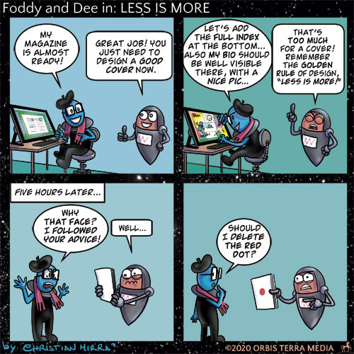
Less is more. And, in today’s over-stimulated world, this is more true than ever: there is nothing so beautiful as simplicity.
As an agency, we know we’ve nailed it when, after weeks of briefings and work, we arrive at a design that is so simple it seems obvious.
Less is more. And, in today’s over-stimulated world, this is more true than ever: there is nothing so beautiful as simplicity.
A recent McDonalds campaign, which highlighted late night opening, is a perfect example of exactly what we mean by this.
It’s good practice to aim for this level of simplicity. If you can get your message across simply and visually then this is going to be more effective and memorable.
IKEA’s campaign to inspire shoppers to use its kitchen items and ingredients is another case in point. In its Canadian stores, during a kitchen promotion event, it provided booklets of recipe ideas printed with food safe inks onto baking parchment featuring its products.
It’s such a simple but effective idea.
To create a successful campaign like this, certain design rules hold true: be generous with space; focus on the messages you want to bring across; and anticipate the reader experience. And, if you’re struggling, seek expert help.
Most importantly, make sure you retain a role for the product or brand experts – because you’ll find the success with which you can simplify a matter is in direct correlation with proficiency.